January 13, 2026 · 1 min read
How to Use Halo Text for Readable Labels
Master the art of map typography by adding glowing halos and shadows to your content.
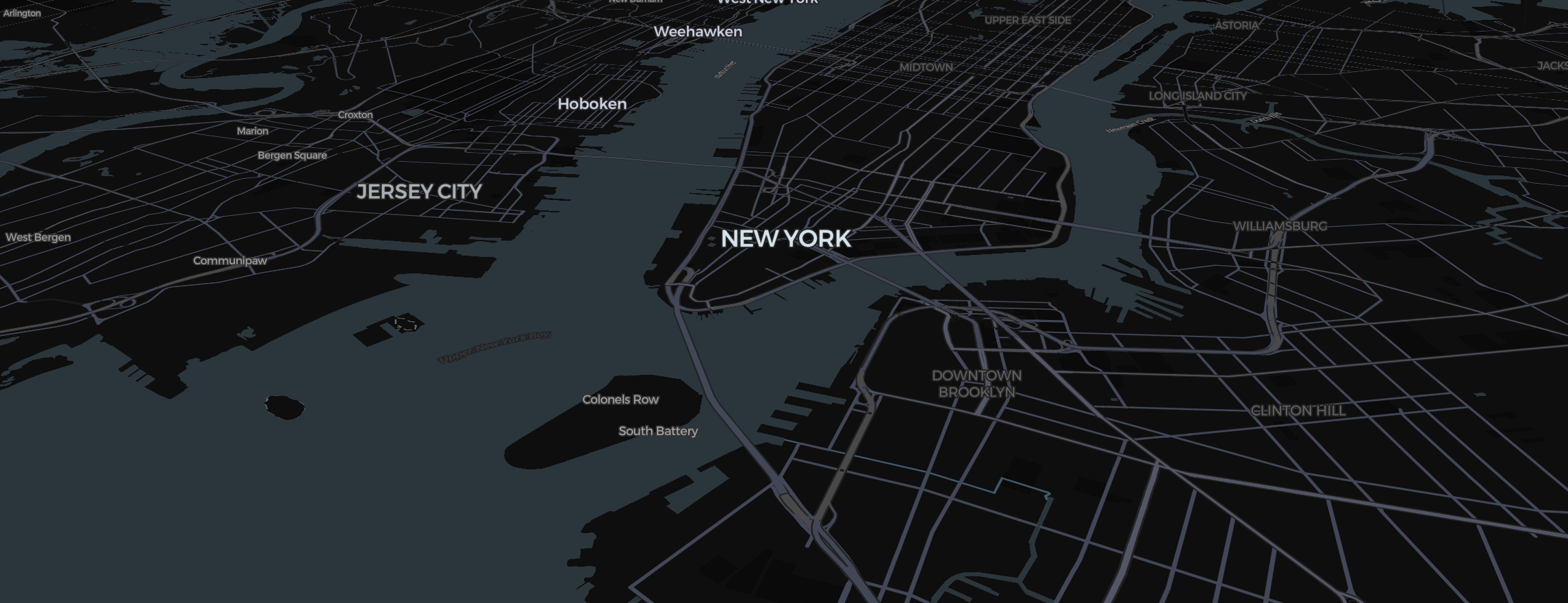
One of the biggest challenges in map design is ensuring your labels are readable over complex 3D terrain and Satellite imagery. In the Mapimator Studio, we solve this with the Halo property in our Text Sticker tool.
What is a Halo?
A Halo is a soft, glowing border around your text. It acts as a buffer between the font and the map colors.
- On Dark Styles (Ink/Dark Matter): Use a White halo with a low width. It makes the text look like it’s glowing in an ops center briefing.
- On Bright Styles (Positron/Voyager): Use a Black or Gray halo to provide contrast against white paper-style backgrounds.
How to add one
- Enter your text using the Text Sticker tool.
- In the sidebar, look for the Halo Width slider.
- Pro-Tip: A Halo Width of 1.0 to 2.0 is usually enough. Any more and the text starts to look "blurry" or "shadowy."
Styling Your Map Titles
- Font Choice: Use Bebas Neue or Montserrat for bold titles. Use Inter for detailed descriptions.
- Color: White text with a black halo is the "Gold Standard" for news and documentaries, as it’s readable over absolutely any color.
Legibility Check
Before you finalize your Storyboard, zoom in and out. If the text disappears when you're close to the 3D buildings, increase the Halo width slightly.
Finally, ensure you professional rendering engine. This ensures that the delicate antialiasing of the text and the soft edge of the halo are perfectly captured in your final high-def MP4.